Origination of icons.
 The word icon originates from a greek word meaning "image". Icons first where generally a flat painting depicting Jesus, Mary, saints and angels. Icons may be cast in metal, carved in stone, embroidered on cloth, painted on wood, done in mosaic or fresco work, printed on paper or metal, etc. back in the day every icon had a symbolic reference with the color and style.
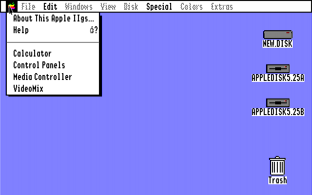
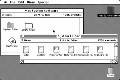
Then after a long time of image icons, we now have this thing called a graphic icon or a Graphical User Interface Icon. and originally they had computerized image of floppy disks, folders, simple colors and words (made by Steve Jobs).

Then once people everywhere started having computers they started making more user friendly, by adding more color, shadow, backgrounds, very visually friendly and easy to use.
Why Put Shadows On Icons?
putting a shadow on icons make all the difference, it adds a lot of character and makes it stand out a lot more. shadows help make the logo stand up and be bolder.

and the best part is, putting a shadow on a logo is probably the easiest and quickest ways to make a log stand out. and i will show you how to put your own shadow on any logo you choose.
How To Put A Shadow On A Logo

I have a tutorial of how to put a shadow on a mail logo. you can copy and paste my first box and follow along, or grab any of your logos you want a shadow on and follow along.
And Tada!!!!!! simple fast and easy, while adding a really cool effect that will make any logo look better.
No comments:
Post a Comment